Optimising Robot Barista's coffee collection

I am the Ui/Ux Lead at Crown Digital, a robotic barista that serves artisanal coffee
I lead the design for our iOS, Android and other hardware interfaces squad. striving to create the bestg in class digital ordering experience on mobile and on touchscreen interfaces.
Timeframe
2023
Role
Ui/Ux Lead
Platforms
Kiosk,
T-OLED
Category
Food & Beverage, Hardware interface

Context
Ella is Singapore's first robot barista and serves artisanal coffee, tea, and chocolate drinks.
We are expanding to Changi Airport & Japan, our Ella machines will be 100% unmanned. We have to make sure that our app & experience is perfect and to solve as many 'unhappy scenarios' as much as possible
Team
We assembled a small but senior cross-functional team to allow us to move faster during project ideation and implementation. We ran weekly update meetings to report progress to stakeholders.
-
Main Stake holders:
-
CEO
-
Head of Technology
-
Head of Marketing & Brand
-
-
Me as the Ui/Ux Lead
-
1 Visual Designer
-
1 Full stack developer
-
2 Backend developers
-
2 Frontend developers
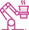
User Journey
This is the typical user journey when a customer buys coffee from Ella. Users will either order from their phones(app) or from the kiosk. Ella will make their coffee and they will have to collect their drink by scanning a QR code.
Along the way, there are many things that I would need to optimise.

Story time!

Denise was having her regular medical check-up at Mount Elizabeth Hospital. However, feeling adventurous, she decided to take a detour from her usual route to the train station.

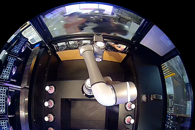
Something caught her eye - a big pink and black box spanning 5 meters wide! Given her adventurous mood, she crept closer to investigate.Upon getting closer, she saw that there was a robot arm in the box that made coffee. With a puzzled look, she paced around the machine, searching for a way to place her order for coffee.

After some searching, she finally found a screen to order from. She selected her order and paid. The robot swiftly flew into action, pouring and preparing her coffee. She quickly grabbed the receipt printed by the machine and placed it in her purse. The robot arm then picked up her coffee and placed it in one of six holes behind curved acrylic transparent screens.

After waiting a few seconds, nothing happened. Denise wondered if she did something wrong, as she couldn't get her coffee. She looked around for help, but the lobby was empty. Her impatience grew, and she forced open the screen to retrieve her coffee.
With coffee in hand, Denise walked away happily, enjoying her drink.
This story is not a rare occurrence, these things happen 1-2 times a week.
This cannot happen when we are at Changi Airport or in Japan where manpower to sort out these mistakes is not available.

Let's start with why? 🔍

1. Abandonment of cups
Abandonment in a user's journey is normally not a big deal in other apps but for Ella it's paralyzing.
Ella has only 6 pigeon-holes to be collected from. Abandoned cups left in pigeon holes will not be usable until it is picked up or a staff member will manually dump them.
2. Forcing open pigeon holes
This can break the machine or render that pigeonhole unuseable.
This might be behavior from operating other vending machines, where you could need to physically open to collect.

3. Not knowing that you need to keep the receipt
From my observations with CCTV footage, most users are not able to collect their coffee. Either throw away the receipt really early in the journey or puts it in their purse or pockets

What problems are we trying to fix and how did I solve them?
Abandonment of cups, not knowing that you need to keep the receipt and forcing the pigeonhole open.
The root cause of these problems is the lack of education on how to order & collect their drinks from Ella
Here is how I try to solve these problems
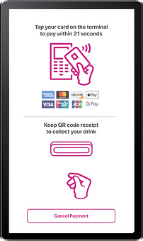
1. Educating users that they need to keep the receipt early
The difficulty here is that we need to change a user's behaviour, when you receive a receipt, what is the first thing you do? You chuck it in your pants, put it in your purse or throw it away. This is an exciting challenge for me because it is difficult to change people's habits.
Old Designs


New Designs


In the older designs, it was not obvious enough to educate users that they would need to keep their receipts and scan them
I used motion design GIFs animation to capture the attention of the users.
I added the same animation while they were paying because we needed to educate them while we have their attention. Using CCTV footage, we noticed that many users did not bother to look at the screen after they have paid, they would just grab their receipt and go.
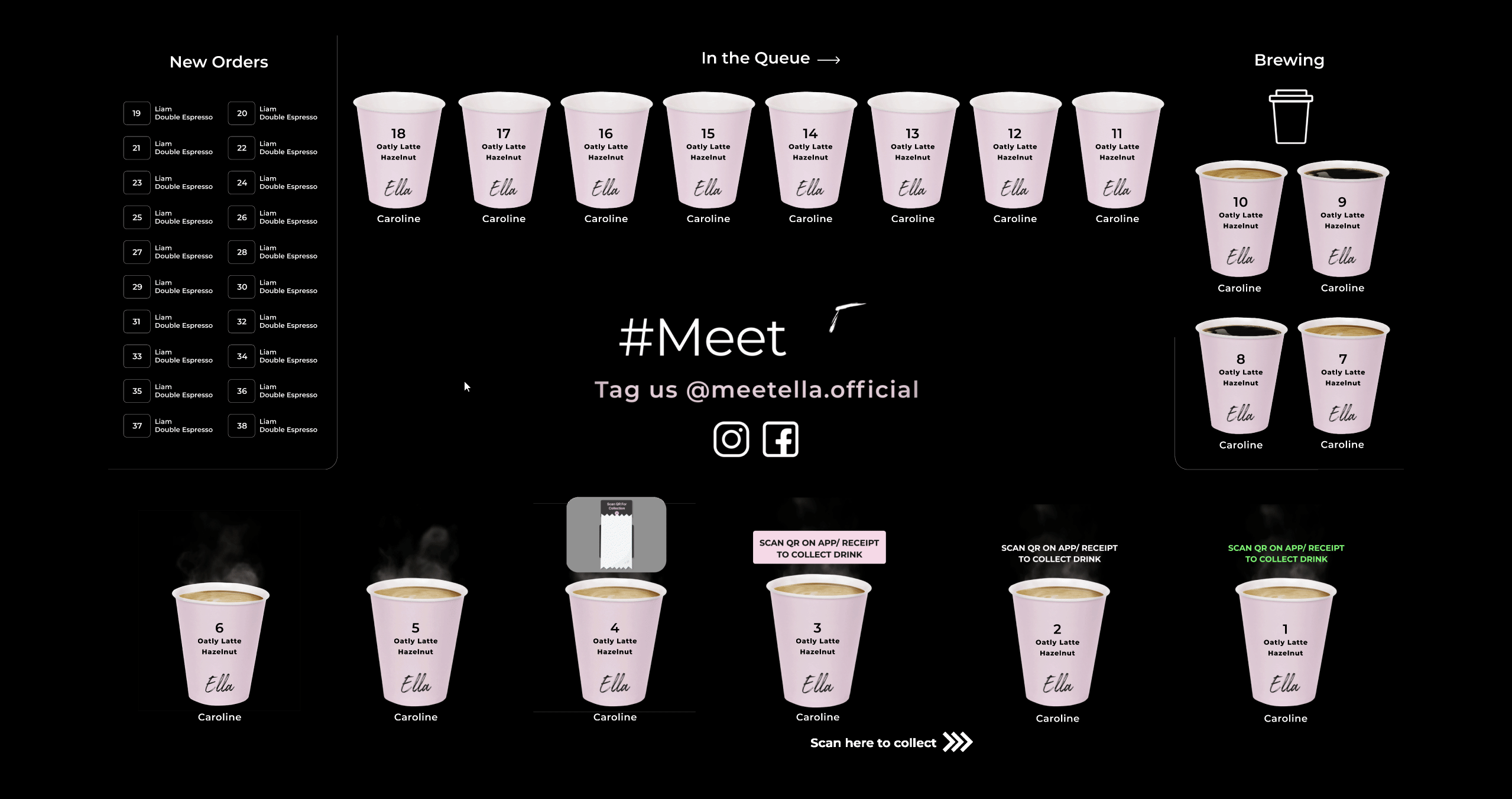
2. Using visuals cues to guide lost sheep
In the images below, are some lost sheep like Denice whose first time interacting with Ella, they might not know how to collect their coffee after ordering it. You can see them tapping on the transparent OLED screen and even trying to force open the pigeonhole when their patience runs out.

(Forcing the pigeon hole open)
(Tapping on the screen, hoping it works)
Coffee making flow on our transparent OLED screen
As you can see, there are no follow-up instructions when your drink is ready to be collected. For a first-time user with low technology literacy, this might be a daunting task. I had to be a lot more empathetic when I was optimising this experience.

This is what users will see when their coffee is ready for collection
For regular customers or customers with high-tech literacy. This might be enough and they could eventually figure it out on their own.
But for the uninitiated, users will feel lost on what are the next steps.
I needed to enhance this visuals to help our users.
Variations I tried
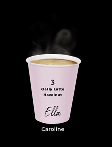
I started with quick instructions for Cups 1 & 2. However, it did not communicate to the users where they need to scan and collect.
To solve that issue, I did 2 variations for the 'infographics' style animations, cups 5 & 4. To make a better-informed choice, I asked my relatives who were a little older and had the traits of Denice.
We went with cup 4 (illustrative style) as aligns better with the visual design of the other visual elements of the TOLED screen.
But I felt that it is FULLY BULLET PROOF & STILL not obvious enough where to scan and collect.
I went back to watch some of the CCTV footage, I was trying to see where was their attention focused on and where exactly are they looking.
We have educated them that they needed to scan a QR on their phone or receipt, but they might not know where EXACTLY to scan it.
The solution I thought of was this:
'Scan here to collect >>>' animation along the entire width of our machine as our scanner is on the right of the screen. This could point users to where they needed to scan.

Outcomes and learnings
Positive Outcomes
Number of times users forced open pigeonholes reduced by 70%
Number of complaints of having issues with collecting drinks reduced by 50%
Learnings
-
Working with evidence (CCTV) was very useful in giving me the confidence to suggest recommendations. Moving forward, I would implement somewhat of a tracking or monitoring system into other projects I would be working on.
-
Knowing the constraints of my developers was very useful, and I made sure to always consult with them on what is feasible and what is not. This resulted in not having wasted time trying non-feasible solutions that could not be implemented.
-
Speaking to the feedback experts, was very useful, they would know what problems the customers are facing and would know the frequency.

